
Networks of Image Regions with ndimage
Tyger Tyger, burning bright,
In the forests of the night;
What immortal hand or eye,
Could frame thy fearful symmetry?— William Blake, The Tyger
You probably know that digital images are made up of pixels. Generally, you should not think of these as little squares, but as point samples of the light signal measured on a regular grid [^alvyraysmith].
Further, when processing images, we often deal with objects much larger than individual pixels. In a landscape, the sky, earth, trees, and rocks each span many pixels. A common structure to represent these is the Region Adjacency Graph, or RAG. Its nodes hold properties of each region in the image, and its links hold the spatial relationships between the regions. Two nodes are linked whenever their corresponding regions touch each other in the input image.
Building such a structure could be a complicated
affair, and even more difficult
when images are not two-dimensional but 3D and even 4D, as is
common in microscopy, materials science, and climatology, among others. But
here we will show you how to produce a RAG in a few lines of code using
NetworkX (a Python library to analyze graphs and networks), and
a filter from SciPy's N-dimensional image processing submodule, ndimage.
The origins of Elegant SciPy {.callout}
(A note from Juan.)
This chapter gets a special mention because it inspired the whole book. Vighnesh Birodkar wrote this code snippet as an undergraduate while participating in Google Summer of Code (GSoC) 2014. When I saw this bit of code, it blew me away. For the purposes of this book, it touches on many aspects of scientific Python. By the time you're done with this chapter, you should be able to process arrays of any dimension, rather than thinking of them only as 1D lists or 2D tables. More than that, you'll understand the basics of image filtering and network processing.
import networkx as nx
import numpy as np
from scipy import ndimage as nd

def add_edge_filter(values, graph):
    center = values[len(values) // 2]
    for neighbor in values:
        if neighbor != center and not graph.has_edge(center, neighbor):
            graph.add_edge(center, neighbor)
    return 0.0


def build_rag(labels, image):
    g = nx.Graph()
    footprint = ndi.generate_binary_structure(labels.ndim, connectivity=1)
    _ = ndi.generic_filter(labels, add_edge_filter, footprint=footprint,
                           mode='nearest', extra_arguments=(g,))
    return g
There are a few things going on here: images being represented as numpy arrays,
filtering of these images using scipy.ndimage, and building of the image
regions into a graph (network) using the NetworkX library. We'll go over these
in turn.
Images are just numpy arrays
In the previous chapter, we saw that numpy arrays can efficiently represent tabular data, and are a convenient way to perform computations on it. It turns out that arrays are equally adept at representing images.
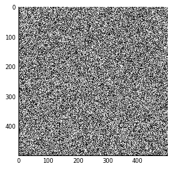
Here's how to create an image of white noise using just numpy, and display it
with matplotlib. First, we import the necessary packages, and use the
matplotlib inline IPython magic to make our images appear below the code:
# Make plots appear inline, set custom plotting style
%matplotlib inline
import matplotlib.pyplot as plt
plt.style.use('style/elegant.mplstyle')
Then, we "make some noise" and display it as an image:
import numpy as np
random_image = np.random.rand(500, 500)
plt.imshow(random_image);
This imshow function displays a numpy array as an image. The converse is also true: an image
can be considered as a numpy array. For this example we use the scikit-image
library, a collection of image processing tools built on top of NumPy and SciPy.
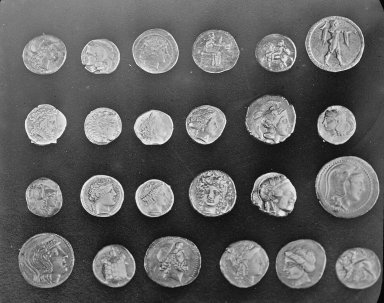
Here is a PNG image from the scikit-image repository. It is a black and white (sometimes called "grayscale") picture of some ancient Roman coins from Pompeii, obtained from the Brooklyn Museum [^coins-source]:
Here is the coin image loaded with scikit-image:
from skimage import io
url_coins = ('https://raw.githubusercontent.com/scikit-image/scikit-image/'
             'v0.10.1/skimage/data/coins.png')
coins = io.imread(url_coins)
print("Type:", type(coins), "Shape:", coins.shape, "Data type:", coins.dtype)
plt.imshow(coins);
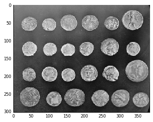
A grayscale image can be represented as a 2-dimensional array, with each array element containing the grayscale intensity at that position. So, an image is just a numpy array.
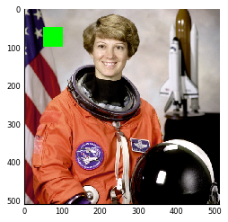
Color images are a 3-dimensional array, where the first two dimensions represent the spatial positions of the image, while the final dimension represents color channels, typically the three primary additive colors of red, green, and blue. To show what we can do with these dimensions, let's play with this photo of astronaut Eileen Collins:
url_astronaut = ('https://raw.githubusercontent.com/scikit-image/scikit-image/'
                 'master/skimage/data/astronaut.png')
astro = io.imread(url_astronaut)
print("Type:", type(astro), "Shape:", astro.shape, "Data type:", astro.dtype)
plt.imshow(astro);

This image is just numpy arrays. Adding a green square to the image is easy once you realize this, using simple numpy slicing:
astro_sq = np.copy(astro)
astro_sq[50:100, 50:100] = [0, 255, 0]  # red, green, blue
plt.imshow(astro_sq);

You can also use a boolean mask, an array of True or False values.
We saw these in Chapter 2 as a way to select rows of a table. In this case, we
can use an array of the same shape as the image to select pixels:
astro_sq = np.copy(astro)
sq_mask = np.zeros(astro.shape[:2], bool)
sq_mask[50:100, 50:100] = True
astro_sq[sq_mask] = [0, 255, 0]
plt.imshow(astro_sq);
Exercise: We just saw how to select a square and paint it green. Can you
extend that to other shapes and colors? Create a function to draw a blue grid
onto a color image, and apply it to the astronaut image of Eileen Collins
(above). Your function should take
two parameters: the input image, and the grid spacing.
Use the following template to help you get started.
def overlay_grid(image, spacing=128):
    """Return an image with a grid overlay, using the provided spacing.

    Parameters
    ----------
    image : array, shape (M, N, 3)
        The input image.
    spacing : int
        The spacing between the grid lines.

    Returns
    -------
    image_gridded : array, shape (M, N, 3)
        The original image with a blue grid superimposed.
    """
    image_gridded = image.copy()
    pass  # replace this line with your code...
    return image_gridded

# plt.imshow(overlay_grid(astro, 128)); # uncomment this line to test your function
Solution: We can use numpy slicing to select the rows of the grid, set them to blue, and then select the columns, and set them to blue as well:
def overlay_grid(image, spacing=128):
    """Return an image with a grid overlay, using the provided spacing.

    Parameters
    ----------
    image : array, shape (M, N, 3)
        The input image.
    spacing : int
        The spacing between the grid lines.

    Returns
    -------
    image_gridded : array, shape (M, N, 3)
        The original image with a blue grid superimposed.
    """
    image_gridded = image.copy()
    image_gridded[spacing:-1:spacing, :] = [0, 0, 255]
    image_gridded[:, spacing:-1:spacing] = [0, 0, 255]
    return image_gridded

plt.imshow(overlay_grid(astro, 128));

Note that we used -1 to mean the last value of the axis, as is standard in
Python indexing. You can omit this value, but the meaning is slightly
different. Without it (i.e. spacing::spacing), you go all the way to the end
of the array, including the final row/column. When you use it as the stop
index, you prevent the final row from being selected. In the case of a grid
overlay, this is probably the desired behavior.
Filters in signal processing
Filtering is one of the most fundamental and common operations in image processing. You can filter an image to remove noise, to enhance features, or to detect edges between objects in the image.
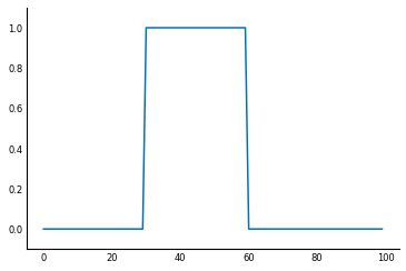
To understand filters, it's easiest to start with a 1D signal, instead of an image. For example, you might measure the light arriving at your end of a fiber-optic cable. If you sample the signal every millisecond (ms) for 100ms, you end up with an array of length 100. Suppose that after 30ms the light signal is turned on, and 30ms later, it is switched off. You end up with a signal like this:
sig = np.zeros(100, np.float) #
sig[30:60] = 1  # signal = 1 during the period 30-60ms because light is observed
fig, ax = plt.subplots()
ax.plot(sig);
ax.set_ylim(-0.1, 1.1);
To find when the light is turned on, you can delay it by 1ms, then subtract the original from the delayed signal. This way, when the signal is unchanged from one millisecond to the next, the subtraction will give zero, but when the signal increases, you will get a positive signal.
When the signal decreases, we will get a negative signal. If we are only interested in pinpointing the time when the light was turned on, we can clip the difference signal, so that any negative values are converted to 0.
sigdelta = sig[1:]  # sigdelta[0] equals sig[1], and so on
sigdiff = sigdelta - sig[:-1]
sigon = np.clip(sigdiff, 0, np.inf)
fig, ax = plt.subplots()
ax.plot(sigon)
ax.set_ylim(-0.1, 1.1)
print('Signal on at:', 1 + np.flatnonzero(sigon)[0], 'ms')
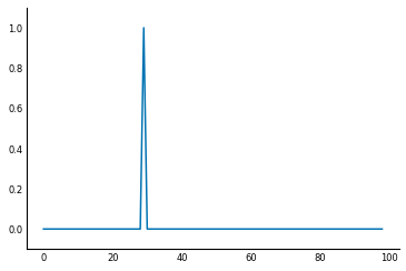
(Here we have used NumPy's flatnonzero function to get the first index where
the sigon array is not equal to 0.)
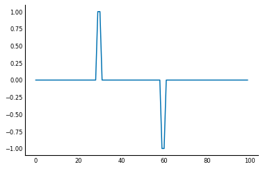
It turns out that this can be accomplished by an signal processing operation called convolution. At every point of the signal, we compute the dot-product between the values surrounding that point and a kernel or filter, which is a predetermined vector of values. Depending on the kernel, then, the convolution shows a different feature of the signal.
Now, think of what happens when the kernel is (1, 0, -1), the difference
filter, for a signal s. At any position i, the convolution result is
1*s[i+1] + 0*s[i] - 1*s[i-1], that is, s[i+1] - s[i-1].
Thus, when the values adjacent to s[i] are identical, the convolution gives 0, but when
s[i+1] > s[i-1] (the signal is increasing), it gives a positive value, and,
conversely, when s[i+1] < s[i-1], it gives a negative value. You can think
of this as an estimate of the derivative of the input function.
In general, the formula for convolution is: $s'(t) = \sum_{j=t-\tau}^{t}{s(j)f(t-j)}$ where $s$ is the signal, $s'$ is the filtered signal, $f$ is the filter, and $\tau$ is the length of the filter.
In scipy, you can use the scipy.ndimage.convolve to work on this.
diff = np.array([1, 0, -1])
from scipy import ndimage as ndi
dsig = ndi.convolve(sig, diff)
plt.plot(dsig);
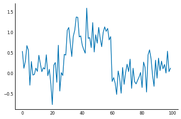
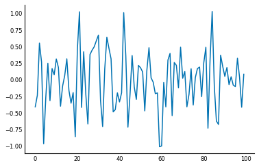
Signals are usually noisy though, not perfect as above:
np.random.seed(0)
sig = sig + np.random.normal(0, 0.3, size=sig.shape)
plt.plot(sig);
The plain difference filter can amplify that noise:
plt.plot(ndi.convolve(sig, diff));
In such cases, you can add smoothing to the filter. The most common form of smoothing is Gaussian smoothing, which takes the weighted average of neighboring points in the signal using the Gaussian function. We can write a function to make a Gaussian smoothing kernel as follows:
def gaussian_kernel(size, sigma):
    """Make a 1D Gaussian kernel of the specified size and standard deviation.

    The size should be an odd number and at least ~6 times greater than sigma
    to ensure sufficient coverage.
    """
    positions = np.arange(size) - size // 2
    kernel_raw = np.exp(-positions**2 / (2 * sigma**2))
    kernel_normalized = kernel_raw / np.sum(kernel_raw)
    return kernel_normalized
A really nice feature feature of convolution is that it's associative, meaning if you want to find the derivative of the smoothed signal, you can equivalently convolve the signal with the smoothed difference filter! This can save a lot of computation time, because you can smooth just the filter, which is usually much smaller than the data.
smooth_diff = ndi.convolve(gaussian_kernel(25, 3), diff)
plt.plot(smooth_diff);
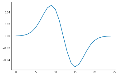
This smoothed difference filter looks for an edge in the central position, but also for that difference to continue. This continuation happens in the case of a true edge, but not in "spurious" edges caused by noise. Check out the result:
sdsig = ndi.convolve(sig, smooth_diff)
plt.plot(sdsig);
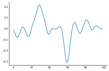
Although it still looks wobbly, the signal-to-noise ratio (SNR), is much greater in this version than when using the simple difference filter.
A note about filtering {.callout}
This operation is called filtering because, in physical electrical circuits, many of these operations are implemented by hardware that allows certain kinds of current through, while blocking others; these hardware components are called filters. For example, a common filter that removes high-frequency voltage fluctuations from a current is called a low-pass filter.
Filtering images (2D filters)
Now that you've seen filtering in 1D, we hope you'll find it straightforward to extend these concepts to 2D signals, such as images. Here's a 2D difference filter for finding the edges in the coins image:
coins = coins.astype(float) / 255  # prevents overflow errors
diff2d = np.array([[0, 1, 0], [1, 0, -1], [0, -1, 0]])
coins_edges = ndi.convolve(coins, diff2d)
io.imshow(coins_edges);
The principle is the same as the 1D filter: at every point in the image, place the filter, compute the dot-product of the filter's values with the image values, and place the result at the same location in the output image. And, as with the 1D difference filter, when the filter is placed on a location with little variation, the dot-product cancels out to zero, whereas, placed on a location where the image brightness is changing, the values multiplied by 1 will be different from those multiplied by -1, and the filtered output will be a positive or negative value (depending on whether the image is brighter towards the bottom-right or top-left at that point).
Just as with the 1D filter, you can get more sophisticated and smooth out noise right within the filter. The Sobel filter is designed to do just that. It comes in horizontal and vertical varieties, to find edges with that orientation in the data. Let's start with the horizontal filter first. To find a horizontal edge in a picture, you might try the following filter:
# column vector (vertical) to find horizontal edges
hdiff = np.array([[1], [0], [-1]])
However, as we saw with 1D filters, this will result in a noisy estimate of the edges in the image. But rather than using Gaussian smoothing, which can cause blurry edges, the Sobel filter uses the property that edges in images tend to be continuous: a picture of the ocean, for example, will contain a horizontal edge along an entire line, not just at specific points of the image. So the Sobel filter smooths the vertical filter horizontally: it looks for a strong edge at the central position that is corroborated by the adjacent positions:
hsobel = np.array([[ 1,  2,  1],
                   [ 0,  0,  0],
                   [-1, -2, -1]])
The vertical Sobel filter is simply the transpose of the horizontal:
vsobel = hsobel.T
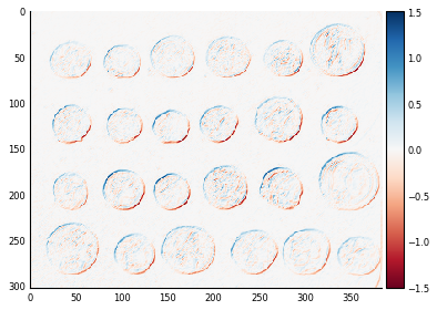
We can then find the horizontal and vertical edges in the coins image:
# Some custom x-axis labelling to make our plots easier to read
def reduce_xaxis_labels(ax, factor):
    """Show only every ith label to prevent crowding on x-axis
        e.g. factor = 2 would plot every second x-axis label,
        starting at the first.

    Parameters
    ----------
    ax : matplotlib plot axis to be adjusted
    factor : int, factor to reduce the number of x-axis labels by
    """
    plt.setp(ax.xaxis.get_ticklabels(), visible=False)
    for label in ax.xaxis.get_ticklabels()[::factor]:
        label.set_visible(True)


coins_h = ndi.convolve(coins, hsobel)
coins_v = ndi.convolve(coins, vsobel)

fig, axes = plt.subplots(nrows=1, ncols=2)
axes[0].imshow(coins_h, cmap=plt.cm.RdBu)
axes[1].imshow(coins_v, cmap=plt.cm.RdBu)
for ax in axes:
    reduce_xaxis_labels(ax, 2)
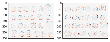
And finally, just like the Pythagorean theorem, you can argue that the edge magnitude in any direction is equal to the square root of the sum of squares of the horizontal and vertical components:
coins_sobel = np.sqrt(coins_h**2 + coins_v**2)
plt.imshow(coins_sobel, cmap='viridis');
Generic filters: arbitrary functions of neighborhood values
In addition to dot-products, implemented by ndi.convolve, SciPy lets you
define a filter that is an arbitrary function of the points in a neighborhood,
implemented in ndi.generic_filter. This can let you express arbitrarily
complex filters.
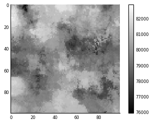
For example, suppose an image represents median house values in a county,
with a 100m x 100m resolution. The local council decides to tax house sales as
$10,000 plus 5% of the 90th percentile of house prices in a 1km radius. (So,
selling a house in an expensive neighborhood costs more.) With
generic_filter, we can produce the map of the tax rate everywhere in the map:
from skimage import morphology
def tax(prices):
    return 10000 + 0.05 * np.percentile(prices, 90)
house_price_map = (0.5 + np.random.rand(100, 100)) * 1e6
footprint = morphology.disk(radius=10)
tax_rate_map = ndi.generic_filter(house_price_map, tax, footprint=footprint)
plt.imshow(tax_rate_map)
plt.colorbar();
Exercise: Conway's Game of Life.
Suggested by Nicolas Rougier.
Conway's Game of Life is a seemingly simple construct in which "cells" on a regular square grid live or die according to the cells in their immediate surroundings. At every timestep, we determine the state of position (i, j) according to its previous state and that of its 8 neighbors (above, below, left, right, and diagonals):
- a live cell with only one live neighbor or none dies.
- a live cell with two or three live neighbors lives on for another generation.
- a live cell with four or more live neighbors dies, as if from overpopulation.
- a dead cell with exactly three live neighbors becomes alive, as if by reproduction.
Although the rules sound like a contrived math problem, they in fact give rise to incredible patterns, starting with gliders (small patterns of live cells that slowly move in each generation) and glider guns (stationary patterns that sprout off gliders), all the way up to prime number generator machines (see, for example, this page), and even simulating Game of Life itself!
Can you implement the Game of Life using ndi.generic_filter?
Solution:
Nicolas Rougier (@rougier) provides a NumPy-only solution on his 100 NumPy Exercises page (Exercise #79):
def next_generation(Z):
    N = (Z[0:-2,0:-2] + Z[0:-2,1:-1] + Z[0:-2,2:] +
         Z[1:-1,0:-2]                + Z[1:-1,2:] +
         Z[2:  ,0:-2] + Z[2:  ,1:-1] + Z[2:  ,2:])

    # Apply rules
    birth = (N==3) & (Z[1:-1,1:-1]==0)
    survive = ((N==2) | (N==3)) & (Z[1:-1,1:-1]==1)
    Z[...] = 0
    Z[1:-1,1:-1][birth | survive] = 1
    return Z
Then we can start a board with:
random_board = np.random.randint(0, 2, size=(50, 50))
n_generations = 100
for generation in range(n_generations):
    random_board = next_generation(random_board)
Using generic filter makes it even easier:
def nextgen_filter(values):
    center = values[len(values) // 2]
    neighbors_count = np.sum(values) - center
    if neighbors_count == 3 or (center and neighbors_count == 2):
        return 1.
    else:
        return 0.

def next_generation(board):
    return ndi.generic_filter(board, nextgen_filter,
                              size=3, mode='constant')
The nice thing is that some formulations of the Game of Life use what's known
as a toroidal board, which means that the left and right ends "wrap around"
and connect to each other, as well as the top and bottom ends. With
generic_filter, it's trivial to modify our solution to incorporate this:
def next_generation_toroidal(board):
    return ndi.generic_filter(board, nextgen_filter,
                              size=3, mode='wrap')
We can now simulate this toroidal board for a few generations:
random_board = np.random.randint(0, 2, size=(50, 50))
n_generations = 100
for generation in range(n_generations):
    random_board = next_generation_toroidal(random_board)
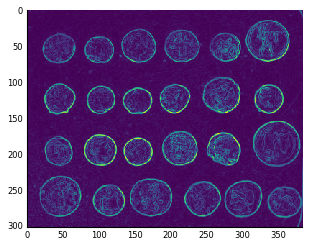
Exercise: Sobel gradient magnitude.
Above, we saw how we can combine the output of two different filters, the
horizontal Sobel filter, and the vertical one. Can you write a function that
does this in a single pass using ndi.generic_filter?
hsobel = np.array([[ 1,  2,  1],
                   [ 0,  0,  0],
                   [-1, -2, -1]])

vsobel = hsobel.T

hsobel_r = np.ravel(hsobel)
vsobel_r = np.ravel(vsobel)

def sobel_magnitude_filter(values):
    h_edge = values @ hsobel_r
    v_edge = values @ vsobel_r
    return np.hypot(h_edge, v_edge)
Now we can try it out on the coins image:
sobel_mag = ndi.generic_filter(coins, sobel_magnitude_filter, size=3)
plt.imshow(sobel_mag, cmap='viridis');

Graphs and the NetworkX library
Graphs are a natural representation for an astonishing variety of data. Pages on the world wide web, for example, can comprise nodes, while links between those pages can be, well, links. Or, in biology, so-called transcription networks have nodes represent genes and edges connect genes that have a direct influence on each other's expression.
Note: graphs and networks {.callout}
In this context, the term "graph" is synonymous with "network", not with "plot". Mathematicians and computer scientists invented slightly different words to discuss these: graph = network, vertex = node, edge = link = arc. As most people do, we will be using these terms interchangeably.
You might be slightly more familiar with the network terminology: a network consists of nodes and links between the nodes. Equivalently, a graph consists of vertices and edges between the vertices. In NetworkX, you have
Graphobjects consisting ofnodesandedgesbetween the nodes, and this is probably the most common usage.
To introduce you to graphs, we will reproduce some results from the paper "Structural properties of the Caenorhabditis elegans neuronal network", by Lav Varshney et al, 2011.
In our example, we will represent neurons in the nematode worm's nervous system as nodes, and place an edge between two nodes when a neuron makes a synapse with another. (Synapses are the chemical connections through which neurons communicate.) The worm is an awesome example of neural connectivity analysis because every worm (of this species) has the same number of neurons (302), and the connections between them are all known. This has resulted in the fantastic Openworm project [^openworm], which we encourage you to read more about.
You can download the neuronal dataset in Excel format from the WormAtlas
database at http://www.wormatlas.org/neuronalwiring.html#Connectivitydata.
The pandas library allows one to read an Excel table over the web, so we will
use it here to read in the data, then feed that into NetworkX.
import pandas as pd
connectome_url = 'http://www.wormatlas.org/images/NeuronConnect.xls'
conn = pd.read_excel(connectome_url)
conn now contains a pandas DataFrame, with rows of the form:
[Neuron1, Neuron2, connection type, strength]
We are only going to examine the connectome of chemical synapses, so we filter out other synapse types as follows:
conn_edges = [(n1, n2, {'weight': s})
              for n1, n2, t, s in conn.itertuples(index=False, name=None)
              if t.startswith('S')]
(Look at the WormAtlas page for a description of the different connection types.)
We use weight in a dictionary above because it is a special keyword for
edge properties in NetworkX. We then build the graph using NetworkX's
DiGraph class:
import networkx as nx
wormbrain = nx.DiGraph()
wormbrain.add_edges_from(conn_edges)
We can now examine some of the properties of this network. One of the first things researchers ask about directed networks is which nodes are the most critical to information flow within it. Nodes with high betweenness centrality are those that belong to the shortest path between many different pairs of nodes. Think of a rail network: certain stations will connect to many lines, so that you will be forced to change lines there for many different trips. They are the ones with high betweenness centrality.
With NetworkX, we can find similarly important neurons with ease. In the
NetworkX API documentation [^nxdoc], under "centrality", the docstring
for betweenness_centrality [^bwcdoc] specifies a function that takes a
graph as input and returns a dictionary mapping node IDs to betweenness
centrality values (floating point values).
centrality = nx.betweenness_centrality(wormbrain)
Now we can find the neurons with highest centrality using the Python built-in
function sorted:
central = sorted(centrality, key=centrality.get, reverse=True)
print(central[:5])
This returns the neurons AVAR, AVAL, PVCR, PVT, and PVCL, which have been implicated in how the worm responds to prodding: the AVA neurons link the worm's front touch receptors (among others) to neurons responsible for backward motion, while the PVC neurons link the rear touch receptors to forward motion.
Varshney et al study the properties of a strongly connected component of 237 neurons, out of a total of 279. In graphs, a connected component is a set of nodes that are reachable by some path through all the links. The connectome is a directed graph, meaning the edges point from one node to the other, rather than merely connecting them. In this case, a strongly connected component is one where all nodes are reachable from each other by traversing links in the correct direction. So A $\rightarrow$ B $\rightarrow$ C is not strongly connected, because there is no way to get to A from B or C. However, A $\rightarrow$ B $\rightarrow$ C $\rightarrow$ A is strongly connected.
In a neuronal circuit, you can think of the strongly connected component as the "brain" of the circuit, where the processing happens, while nodes upstream of it are inputs, and nodes downstream are outputs.
Cycles in neuronal networks {.callout}
The idea of cyclical neuronal circuits dates back to the 1950s. Here's a lovely paragraph about this idea from an article in Nautilus, "The Man Who Tried to Redeem the World With Logic", by Amanda Gefter:
If one were to see a lightning bolt flash on the sky, the eyes would send a signal to the brain, shuffling it through a chain of neurons. Starting with any given neuron in the chain, you could retrace the signal's steps and figure out just how long ago the lightning struck. Unless, that is, the chain is a loop. In that case, the information encoding the lightning bolt just spins in circles, endlessly. It bears no connection to the time at which the lightning actually occurred. It becomes, as McCulloch put it, "an idea wrenched out of time." In other words, a memory.
NetworkX makes straightforward work out of getting the largest strongly
connected component from our wormbrain network:
sccs = nx.strongly_connected_component_subgraphs(wormbrain)
giantscc = max(sccs, key=len)
print(f'The largest strongly connected component has '
      f'{giantscc.number_of_nodes()} nodes, out of '
      f'{wormbrain.number_of_nodes()} total.')
As noted in the paper, the size of this component is smaller than expected by chance, demonstrating that the network is segregated into input, central, and output layers.
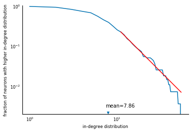
Now we reproduce figure 6B from the paper, the survival function of the in-degree distribution. First, compute the relevant quantities:
in_degrees = list(dict(wormbrain.in_degree()).values())
in_deg_distrib = np.bincount(in_degrees)
avg_in_degree = np.mean(in_degrees)
cumfreq = np.cumsum(in_deg_distrib) / np.sum(in_deg_distrib)
survival = 1 - cumfreq
Then, plot using Matplotlib:
fig, ax = plt.subplots()
ax.loglog(np.arange(1, len(survival) + 1), survival)
ax.set_xlabel('in-degree distribution')
ax.set_ylabel('fraction of neurons with higher in-degree distribution')
ax.scatter(avg_in_degree, 0.0022, marker='v')
ax.text(avg_in_degree - 0.5, 0.003, 'mean=%.2f' % avg_in_degree)
ax.set_ylim(0.002, 1.0);
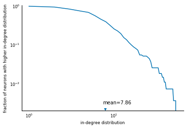
There you have it: a reproduction of a scientific analysis, using SciPy. We are missing the line fit.... But that's what exercises are for.
This exercise is a bit of a preview for chapter 7 (optimization):
use scipy.optimize.curve_fit to fit the tail of the
in-degree survival function to a power-law,
$f(d) \sim d^{-\gamma}, d > d_0$,
for $d_0 = 10$ (the red line in Figure 6B of the paper), and modify the plot
to include that line.
Solution: Let's look at the start of the docstring for curve_fit:
It looks like we just need to provide a function that takes in a data point, and some parameters, and returns the predicted value. In our case, we want the cumulative remaining frequency, $f(d)$ to be proportional to $d^{-\gamma}$. That means we need $f(d) = \alpha d^{-gamma}$:
def fraction_higher(degree, alpha, gamma):
    return alpha * degree ** (-gamma)
Then, we need our x and y data to fit, for $d > 10$:
x = 1 + np.arange(len(survival))
valid = x > 10
x = x[valid]
y = survival[valid]
We can now use curve_fit to obtain fit parameters:
from scipy.optimize import curve_fit

alpha_fit, gamma_fit = curve_fit(fraction_higher, x, y)[0]
Let's plot the results to see how we did:
y_fit = fraction_higher(x, alpha_fit, gamma_fit)

fig, ax = plt.subplots()
ax.loglog(np.arange(1, len(survival) + 1), survival)
ax.set_xlabel('in-degree distribution')
ax.set_ylabel('fraction of neurons with higher in-degree distribution')
ax.scatter(avg_in_degree, 0.0022, marker='v')
ax.text(avg_in_degree - 0.5, 0.003, 'mean=%.2f' % avg_in_degree)
ax.set_ylim(0.002, 1.0)
ax.loglog(x, y_fit, c='red');
Voilà! A full Figure 6B, fit and all!
You now should have a fundamental understanding of graphs as a scientific abstraction, and how to easily manipulate and analyse them using Python and NetworkX. Now, we move on to a particular kind of graph used in image processing and computer vision.
Region adjacency graphs
A Region Adjacency Graph (RAG) is a representation of an image that is useful for segmentation: the division of images into meaningful regions (or segments). If you've seen Terminator 2, you've seen segmentation:

Segmentation is one of those problems that humans do trivially, all the time, without thinking, whereas computers have a hard time of it. To understand this difficulty, look at this image:

While you see a face, a computer only sees a bunch of numbers:
Our visual system is so optimized to spot faces that you might see the face even in this blob of numbers! But we hope our point is made. Also, you might want to look for the "Faces In Things" Tumblr, which demonstrates the face-finding optimization of our visual systems far more humorously.
At any rate, the challenge is to make sense of those numbers, and where the boundaries lie that divide the different parts of the image. A popular approach is to find small regions (called superpixels) that you're sure belong in the same segment, and then merge those according to some more sophisticated rule.
As a simple example, suppose you want to segment out the tiger in this picture, from the Berkeley Segmentation Dataset (BSDS):

A clustering algorithm, simple linear iterative clustering (SLIC) [^slic], can give us a decent starting point. It is available in the scikit-image library.
url = ('http://www.eecs.berkeley.edu/Research/Projects/CS/vision/'
       'bsds/BSDS300/html/images/plain/normal/color/108073.jpg')
tiger = io.imread(url)
from skimage import segmentation
seg = segmentation.slic(tiger, n_segments=30, compactness=40.0,
                        enforce_connectivity=True, sigma=3)
Scikit-image also has a function to display segmentations, which we use to visualize the result of SLIC:
from skimage import color
io.imshow(color.label2rgb(seg, tiger));
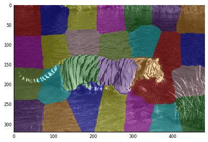
This shows that the body of the tiger has been split in three parts, with the rest of the image in the remaining segments.
A region adjacency graph (RAG) is a graph in which every node represents one
of the above regions, and an edge connects two nodes when they touch. For a
taste of what it looks like before we build one, we'll use the show_rag function
from scikit-image — indeed, the library that contains this chapter's code snippet!
from skimage.future import graph

g = graph.rag_mean_color(tiger, seg)
graph.show_rag(seg, g, tiger);
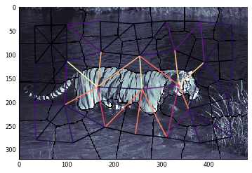
Here, you can see the nodes corresponding to each segment, and the edges between adjacent segments. These are colored with the YlGnBu (yellow-green-blue) colormap from matplotlib, according to the difference in color between the two nodes.
The figure also shows the magic of thinking of segmentations as graphs: you can see that edges between nodes within the tiger and those outside of it are brighter (higher-valued) than edges within the same object. Thus, if we can cut the graph along those edges, we will get our segmentation. We have chosen an easy example for color-based segmentation, but the same principles hold true for graphs with more complicated pairwise relationships.
Elegant ndimage: how to build graphs from image regions
All the pieces are in place: you know about numpy arrays, image filtering, generic filters, graphs, and region adjacency graphs. Let's build one to pluck the tiger out of that picture!
The obvious approach is to use two nested for-loops to iterate over every pixel of the image, look at the neighboring pixels, and checking for different labels:
import networkx as nx
def build_rag(labels, image):
    g = nx.Graph()
    nrows, ncols = labels.shape
    for row in range(nrows):
        for col in range(ncols):
            current_label = labels[row, col]
            if not current_label in g:
                g.add_node(current_label)
                g.node[current_label]['total color'] = np.zeros(3, dtype=np.float)
                g.node[current_label]['pixel count'] = 0
            if row < nrows - 1 and labels[row + 1, col] != current_label:
                g.add_edge(current_label, labels[row + 1, col])
            if col < ncols - 1 and labels[row, col + 1] != current_label:
                g.add_edge(current_label, labels[row, col + 1])
            g.node[current_label]['total color'] += image[row, col]
            g.node[current_label]['pixel count'] += 1
    return g
Whew! This works, but if you want to segment a 3D image, you'll have to write a different version:
import networkx as nx
def build_rag_3d(labels, image):
    g = nx.Graph()
    nplns, nrows, ncols = labels.shape
    for pln in range(nplns):
        for row in range(nrows):
            for col in range(ncols):
                current_label = labels[pln, row, col]
                if not current_label in g:
                    g.add_node(current_label)
                    g.node[current_label]['total color'] = np.zeros(3, dtype=np.float)
                    g.node[current_label]['pixel count'] = 0
                if pln < nplns - 1 and labels[pln + 1, row, col] != current_label:
                    g.add_edge(current_label, labels[pln + 1, row, col])
                if row < nrows - 1 and labels[pln, row + 1, col] != current_label:
                    g.add_edge(current_label, labels[pln, row + 1, col])
                if col < ncols - 1 and labels[pln, row, col + 1] != current_label:
                    g.add_edge(current_label, labels[pln, row, col + 1])
                g.node[current_label]['total color'] += image[pln, row, col]
                g.node[current_label]['pixel count'] += 1
    return g
Both of these are pretty ugly and unwieldy, too. And difficult to extend: if we want to count diagonally neighboring pixels as adjacent (that is, [row, col] is "adjacent to" [row + 1, col + 1]), the code becomes even messier. And if we want to analyze 3D video, we need yet another dimension, and another level of nesting. It's a mess!
Enter Vighnesh's insight: SciPy's generic_filter function already does
this iteration for us! We used it above to compute an arbitrarily
complicated function on the neighborhood of every element of a numpy
array. Only now we don't want a filtered image out of the function: we
want a graph. It turns out that generic_filter lets you pass additional
arguments to the filter function, and we can use that to build the graph:
import networkx as nx
import numpy as np
from scipy import ndimage as nd

def add_edge_filter(values, graph):
    center = values[len(values) // 2]
    for neighbor in values:
        if neighbor != center and not graph.has_edge(center, neighbor):
            graph.add_edge(center, neighbor)
    # float return value is unused but needed by `generic_filter`
    return 0.0

def build_rag(labels, image):
    g = nx.Graph()
    footprint = ndi.generate_binary_structure(labels.ndim, connectivity=1)
    _ = ndi.generic_filter(labels, add_edge_filter, footprint=footprint,
                           mode='nearest', extra_arguments=(g,))
    for n in g:
        g.node[n]['total color'] = np.zeros(3, np.double)
        g.node[n]['pixel count'] = 0
    for index in np.ndindex(labels.shape):
        n = labels[index]
        g.node[n]['total color'] += image[index]
        g.node[n]['pixel count'] += 1
    return g
Here are a few reasons this is a brilliant piece of code:
ndi.generic_filteriterates over array elements with their neighbors. (Usenumpy.ndindexto simply iterate over array indices.)- We return "0.0" from the filter function because
generic_filterrequires the filter function to return a float. However, we ignore the filter output (which is zero everywhere), and use it only for its "side effect" of adding edges to the graph. - The loops are not nested several levels deep. This makes the code more compact, easier to take in in one go.
- The code works identically for 1D, 2D, 3D, or even 8D images!
- If we want to add support for diagonal connectivity, we just need to
change the
connectivityparameter tondi.generate_binary_structure
Putting it all together: mean color segmentation
Now, we can use everything we've learned to segment the tiger in the image above:
g = build_rag(seg, tiger)
for n in g:
    node = g.node[n]
    node['mean'] = node['total color'] / node['pixel count']
for u, v in g.edges():
    d = g.node[u]['mean'] - g.node[v]['mean']
    g[u][v]['weight'] = np.linalg.norm(d)
Each edge holds the difference between the average color of each segment. We can now threshold the graph:
def threshold_graph(g, t):
    to_remove = [(u, v) for (u, v, d) in g.edges(data=True)
                 if d['weight'] > t]
    g.remove_edges_from(to_remove)
threshold_graph(g, 80)
Finally, we use the numpy index-with-an-array trick we learned in chapter 2:
map_array = np.zeros(np.max(seg) + 1, int)
for i, segment in enumerate(nx.connected_components(g)):
    for initial in segment:
        map_array[int(initial)] = i
segmented = map_array[seg]
plt.imshow(color.label2rgb(segmented, tiger));
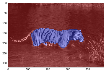
Oops! Looks like the cat lost its tail!
Still, we think that's a nice demonstration of the capabilities of RAGs... And the beauty with which SciPy and NetworkX make it feasible. Many of these functions are available in the scikit-image library. If you are interested in image analysis, look it up!